
OMa
Naming, Brand Identity, Positioning & Copywriting
for Holland Partner Group
OMa is a new multifamily development on Market Street in the heart of Ballard, completing a long-awaited piece of the neighborhood’s commercial core. Featuring primarily one- and two-bedroom apartments, neighborhood retail and a collection of indoor and outdoor shared spaces, the property was developed by Holland Partner Group with architecture by Ankrom Moisan and interiors by Uppercase.
AFMKTG created the name, positioning, brand identity and messaging to establish OMa as a natural addition to the neighborhood and the next chapter for this prominent stretch of Market Street.

ABOUT THE PROJECT
Project Overview
Ballard does not need another generic apartment building.
For decades, one central stretch of Market Street remained unfinished while the neighborhood around it grew into a destination for restaurants, live music, independent businesses and outdoor culture. OMa fills in that missing piece, reconnecting the block with the energy of Ballard’s commercial core.
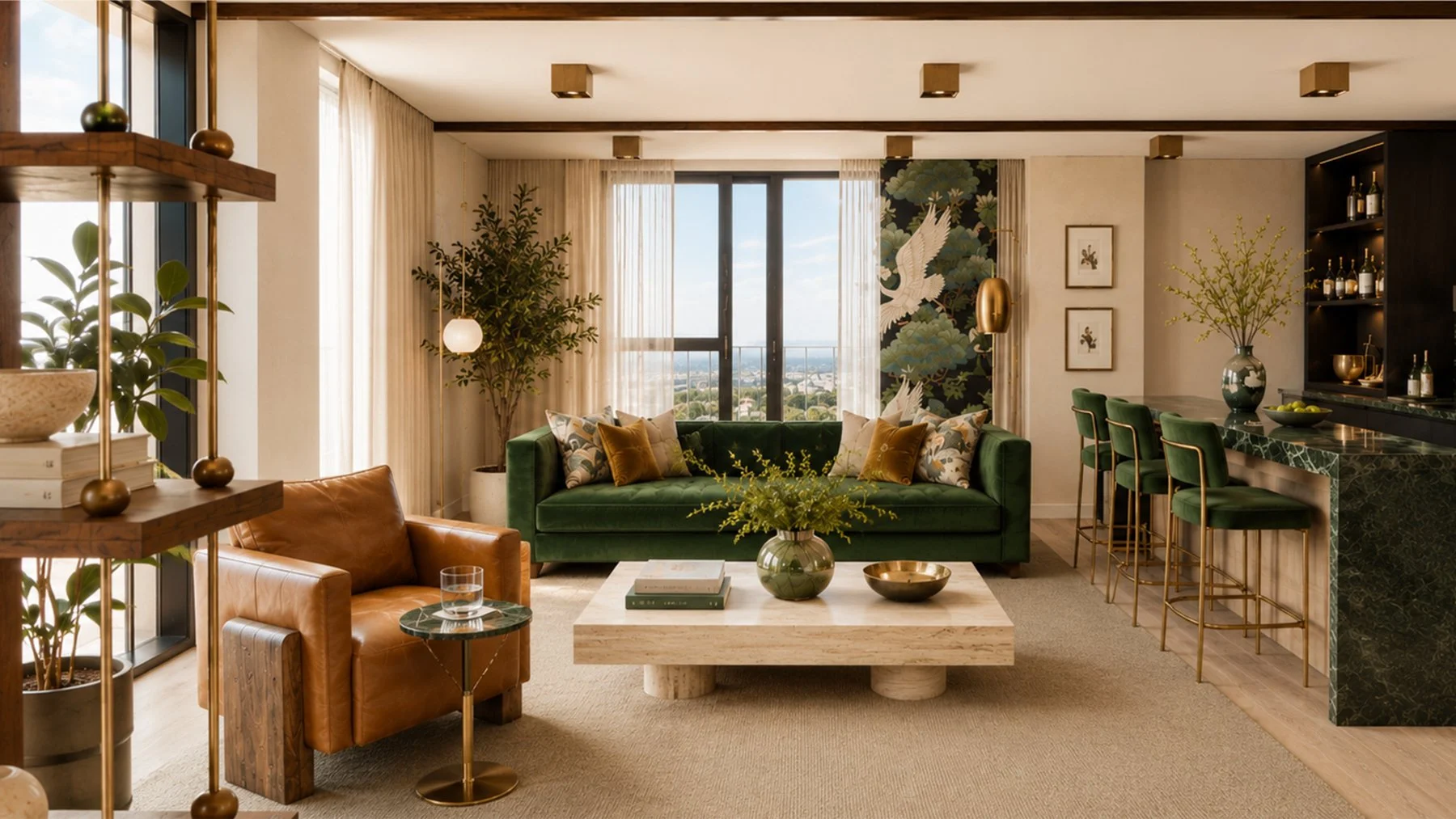
The development takes its cues from a neighborhood shaped by fishing, shipbuilding and generations of makers and small businesses. Primarily one- and two-bedroom homes offer more room to put down roots, while rich color, layered textures, collected artwork and expressive interiors give the property warmth and character from the start.
A rooftop clubroom and terrace, coworking lounge, courtyard, fitness studio and rooftop dog run are designed around everyday use, not just the amenity list. Outside the door, Market Street puts residents within minutes of Ballard Ave, the Farmers Market, Tractor Tavern, the Locks and the Burke-Gilman.
OMa is new, but the idea was never to reinvent Ballard. It was to create something that feels like it was meant to be there.
AFMKTG’s Approach
AFMKTG positioned OMa around an important distinction: the project was not introducing Ballard to itself.
The neighborhood already had the equity. Our role was to develop a brand capable of adding to it.
We looked to Ballard’s history of craftsmanship alongside the neighborhood it has become today: active, cultured, independent and increasingly grown up. That informed a positioning strategy centered on warmth, texture and discovery rather than novelty for novelty’s sake.
The resulting brand gives Holland Partner Group a clear market position while connecting the leasing story directly to the experience of living on Market Street.
More character. Less copy and paste.
Brand Naming & Positioning
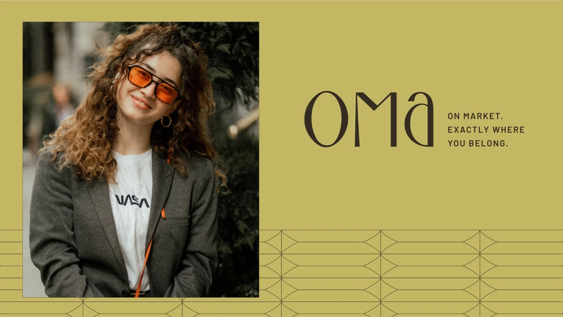
OMa takes its identity directly from its location: On Market.
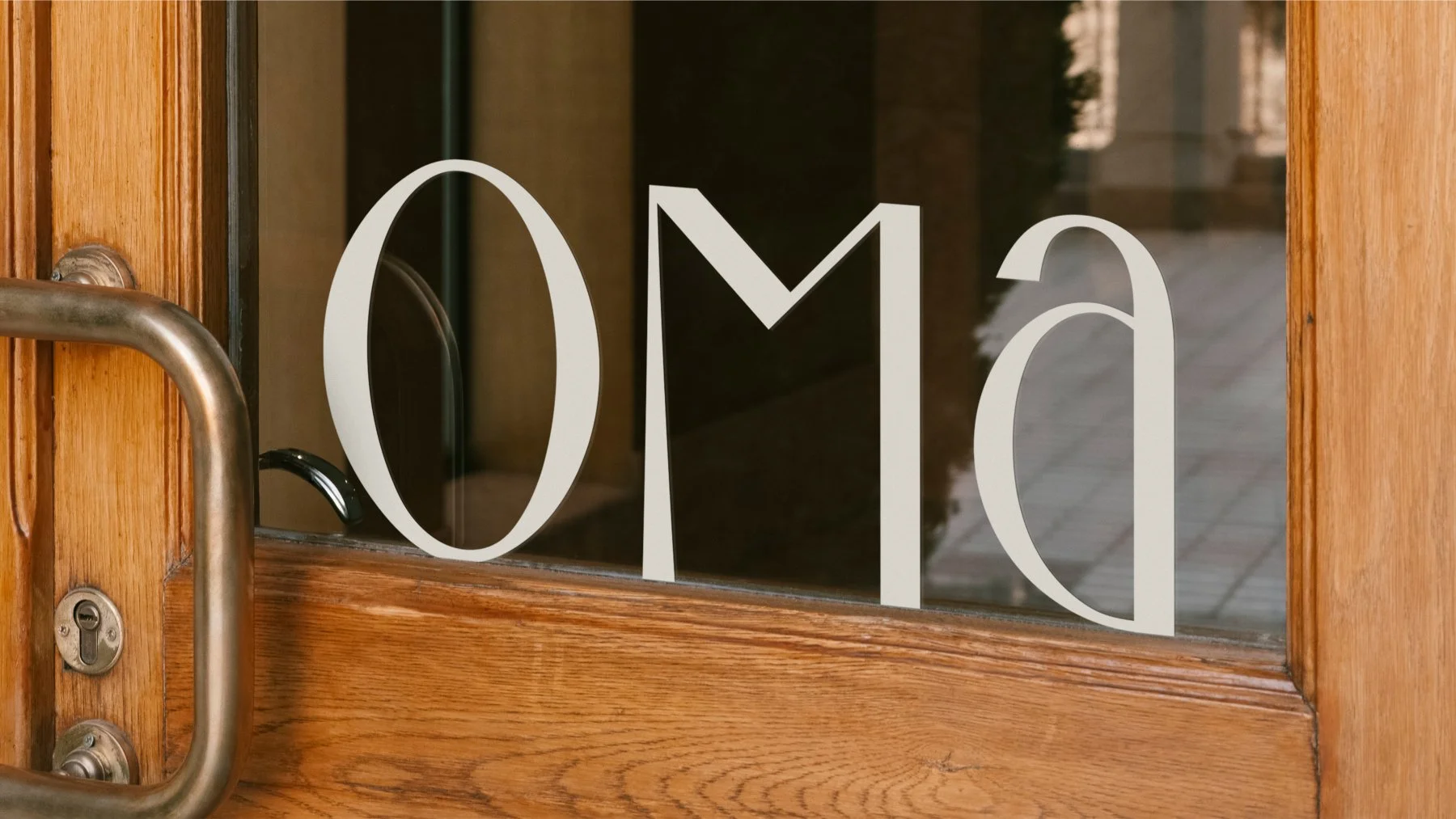
The name turns a simple geographic advantage into a memorable brand asset. Short, ownable and easy to use, OMa establishes the property’s relationship with Market Street from the first interaction.
That location became more than an address. It became the foundation of the positioning.
Living at OMa means being part of Ballard’s everyday rhythm, with restaurants, independent businesses, music, neighborhood institutions and daily essentials woven into life outside the front door.
The brand builds on that advantage with a personality that reflects Ballard itself: confident, cultured and grown up, yet always evolving.
Visual Identity & Art Direction
OMa’s visual identity takes its cues from Ballard itself: grounded in craftsmanship, but with a more cultured, contemporary point of view.
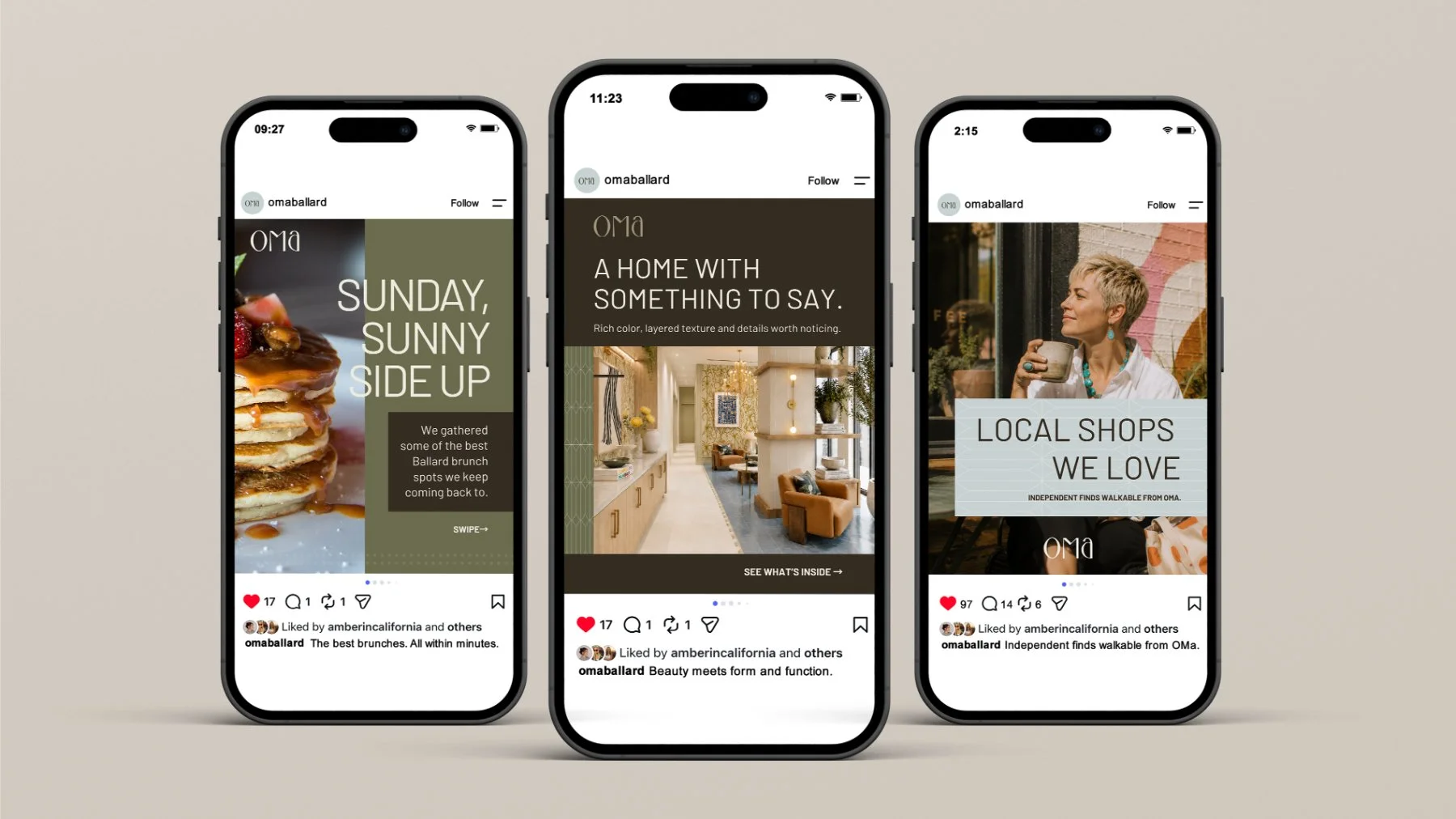
A warm foundation of dark chocolate and soft foam gives the brand depth, while leaf green, fog blue and an unexpected yellow bring in color inspired by the Northwest landscape. The palette feels rich without becoming precious, and gives the system enough range to move between quiet, sophisticated moments and more expressive applications.
Texture plays an equally important role. Tactile materials, layered compositions and a collected approach to art direction echo the interiors, reinforcing the idea that OMa should feel lived in rather than newly unwrapped.
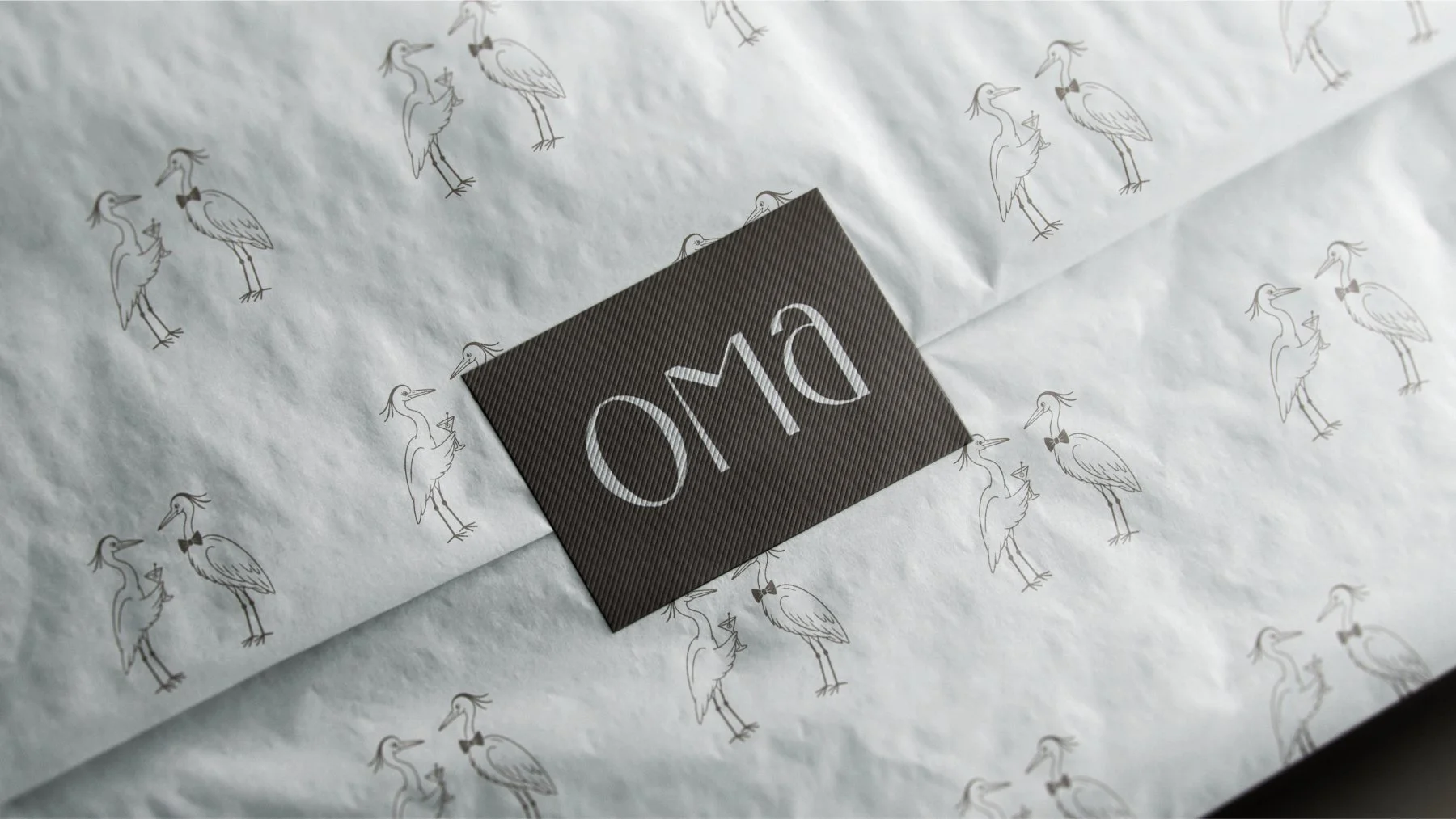
The brand’s Great Blue Heron illustration brings a distinctly Ballard detail into the system. Inspired by the herons that nest near the Locks, the cocktail-sharing pair adds wit and personality without turning the neighborhood into a theme. Used selectively across pieces like coasters, matchbooks, event materials and resident gifts, the illustration becomes something to discover rather than a graphic motif repeated everywhere.
Together, the palette, texture and illustration give OMa a visual language with warmth, restraint and a strong sense of place. It feels established rather than overly polished, with just enough personality to keep things interesting.
Copywriting & Messaging Framework
OMa’s voice is warm, direct and confident, written for renters who already know why they want to be in Ballard. Instead of selling the neighborhood back to them, the messaging speaks like a local, naming real places, using familiar language and letting specificity do the work.
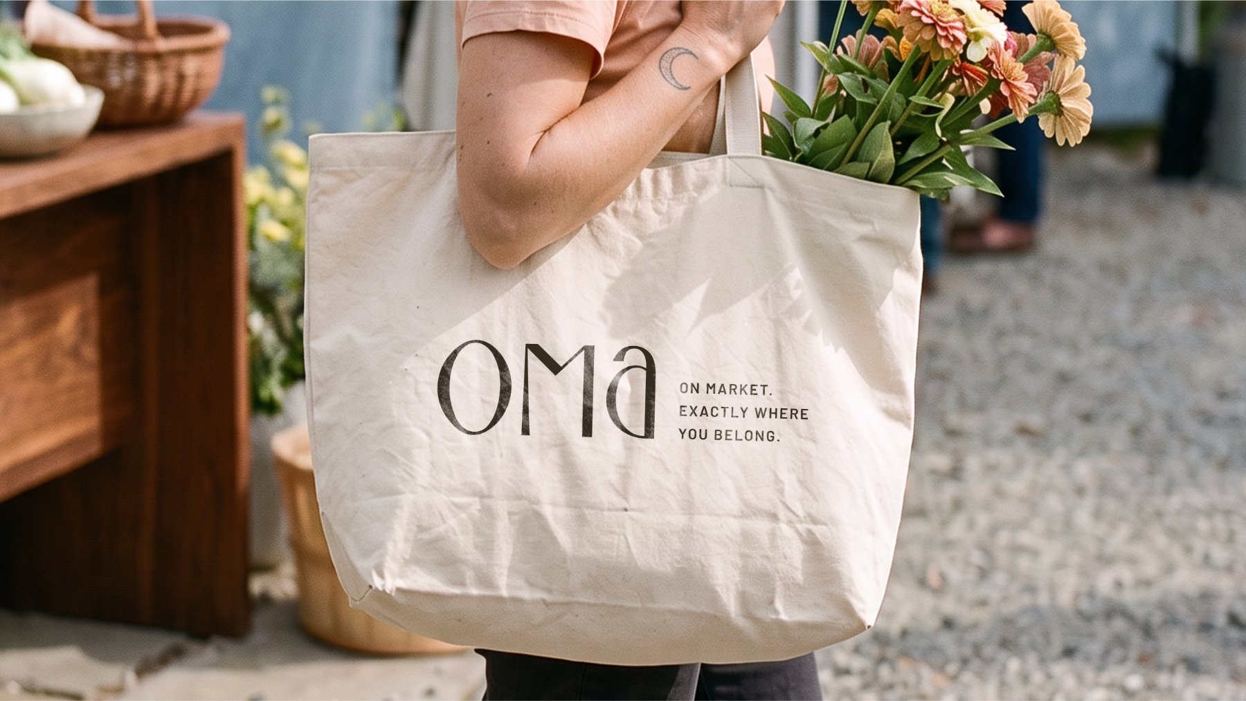
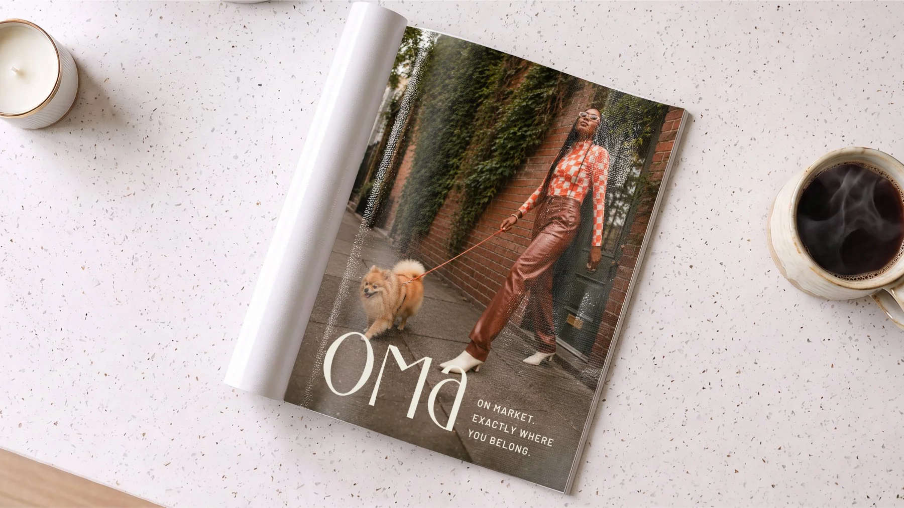
“On Market. Exactly where you belong.” anchors the brand, connecting OMa’s name and location to a larger idea of belonging. That same thinking comes through in “We may be new, but we feel right at home.” OMa is new construction, but it isn’t here to reinvent Ballard. The messaging takes its cues from the neighborhood, respects the character already here and positions the property as a natural addition rather than another generic apartment building.
That sense of place carries into the everyday details. “The mountain’s out. Meet us on the roof.” turns a rooftop amenity into a distinctly Seattle moment, bringing personality to the leasing story without slipping into sales language.
The result is a voice that feels specific to OMa and comfortable in Ballard: informed, understated, and confident.
Key Deliverables
Brand Naming & Positioning Strategy
Logo & Visual Identity System
Brand Guidelines & Standards Documentation
Art Direction
Copywriting & Messaging Framework
Residence & Amenity Descriptions
Marketing & Leasing Copy
Related Work
Renley: Multifamily Branding in Arlington
Naming, brand identity, and copywriting for Gilbane Development
Resa: Multifamily Branding in Long Beach
Naming, brand identity, and copywriting for Holland Partner Group
Sloane: Multifamily Branding in Seattle
Brand strategy for Holland Partner Group's Pacific Northwest flagship
About AFMKTG
AFMKTG is a real estate development branding agency headquartered in California. The agency builds brand systems for multifamily, student housing, mixed-use, and hospitality developments across the country, from naming and identity to go-to-market strategy and social media management.
Start a project with AFMKTG
Great developments deserve brands with just as much ambition. Let’s build yours.
Inquire below or send your project details to hello@afmktg.com.
