
Daelo
Naming, Brand Identity, Positioning & Copywriting
for Holland Partner Group
Daelo is a collection of 189 studio, one- and two-bedroom apartments in the heart of Fremont, Seattle’s self-proclaimed Center of the Universe.
AFMKTG partnered with Holland Partner Group to build a distinctive multifamily brand shaped by the neighborhood’s independent, creative character and affinity for the unexpected.
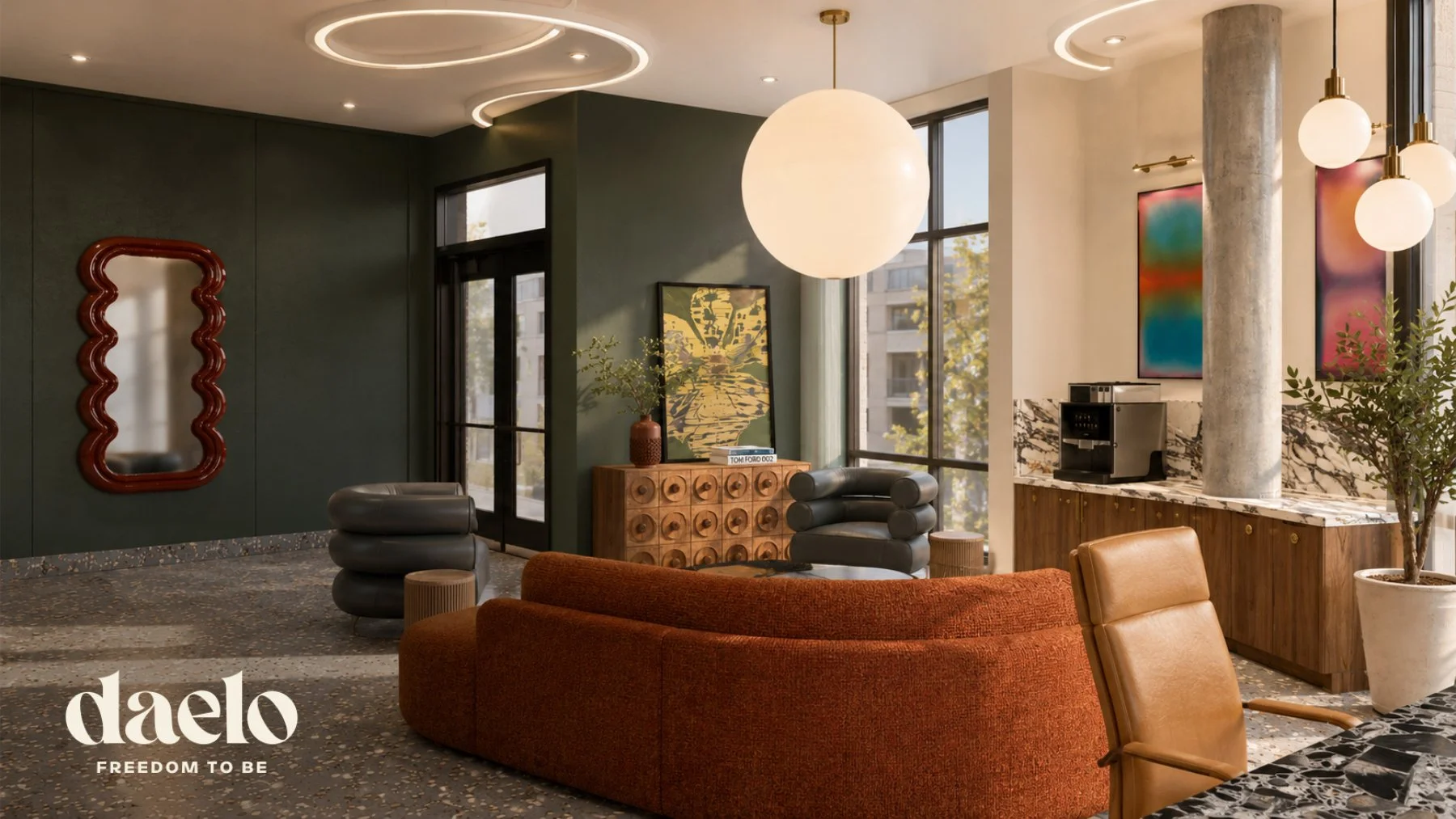
Architecture by Weber Thompson and interiors by Ariel Fox Design carry that personality into the resident experience through expressive color, layered materials, and playful details that feel right at home in Fremont.


ABOUT THE PROJECT
Project Overview
Fremont has always been a little different, and proudly so.
This is the Seattle neighborhood where a giant troll lives beneath a bridge, a larger-than-life statue of Lenin stands in the middle of the business district, and a rocket points skyward from a building marked “Center of the Universe.” Public art appears where you least expect it. Solstice brings painted cyclists into the streets. And the neighborhood’s unofficial motto, De Libertas Quirkas, translates to “Freedom to be Peculiar.”
Daelo was designed to join that world, not clean it up.
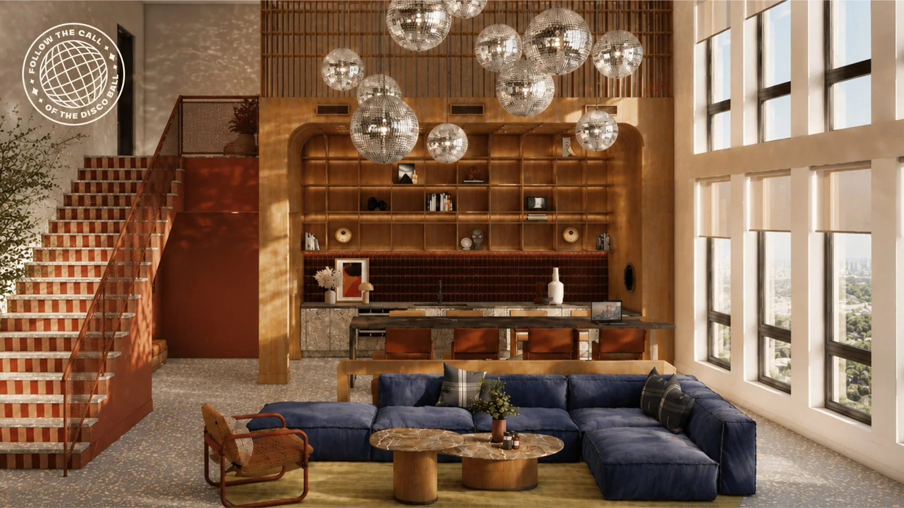
Rather than impose a generic apartment experience on a neighborhood known for individuality, the development takes its cues from the character already here. Jewel-toned interiors, stained glass, mosaic details, expressive artwork and disco balls bring personality to spaces that could easily have played it safe.
The opportunity was not to create the loudest building in Fremont. It was to create one with enough confidence and character to belong here.
A little sophisticated. A little funky. Entirely at home.
AFMKTG’s Approach
AFMKTG built Daelo’s brand around expressing individuality.
Our approach connected the property’s expressive interior design with Fremont’s cultural identity, giving Holland Partner Group a positioning platform that could carry from first impression through leasing and resident experience.
Instead of relying on familiar multifamily language, the brand embraces contrast. Sophisticated, but funky. Design-forward, but approachable. New, but unmistakably Fremont.
That tension became Daelo’s advantage, giving the property a memorable point of view in a market where new apartment developments can quickly begin to feel interchangeable.
Brand Positioning
A little unexpected. A little funky. Entirely at home.
Daelo was positioned around a simple idea: in Fremont, fitting in means being comfortable standing out.
The brand embraces individuality without turning the neighborhood’s weirdness into a gimmick. It’s colorful, confident and playful, taking cues from Fremont while bringing a personality all its own.
The result is a brand-new building that feels like it belongs here, precisely because it doesn’t look or sound like everything else.
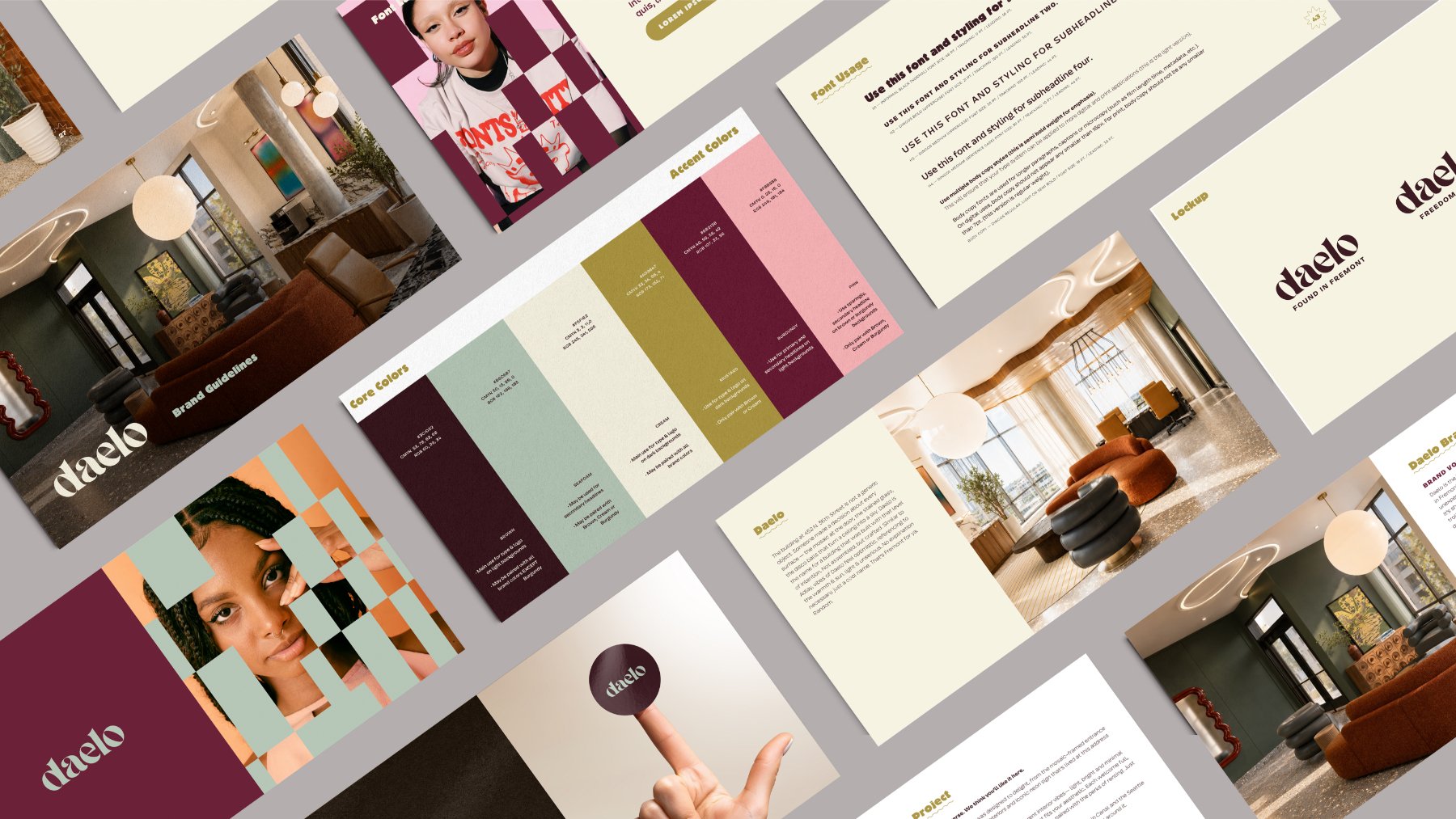
Visual Identity & Art Direction
Daelo’s visual identity was designed to feel as alive and unexpected as Fremont itself.
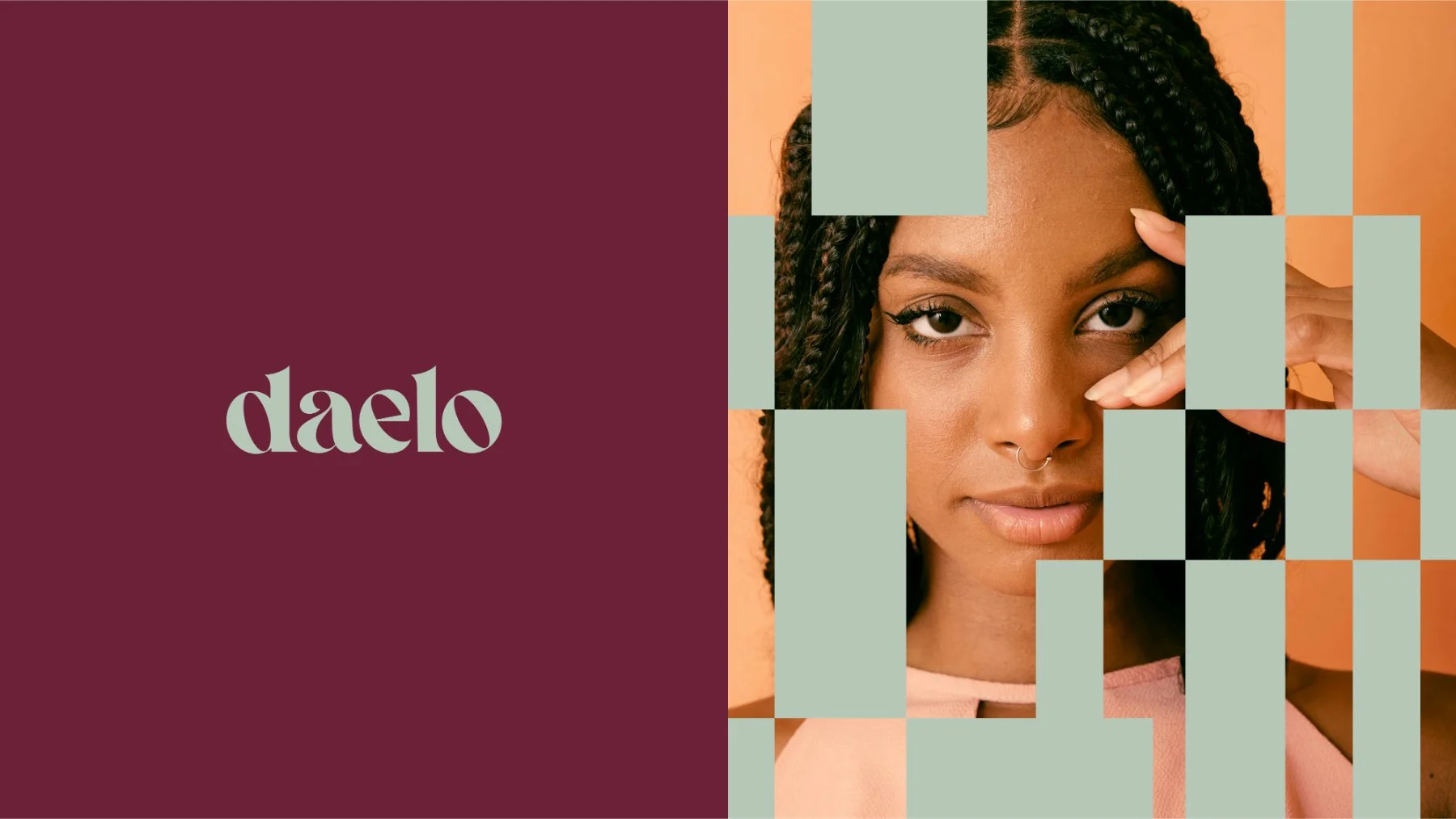
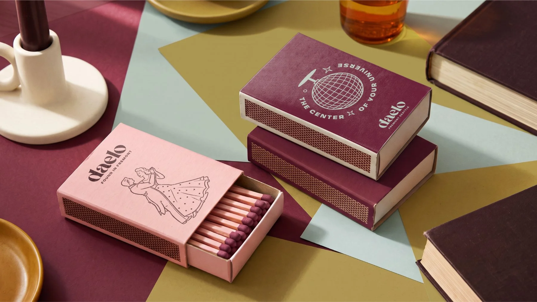
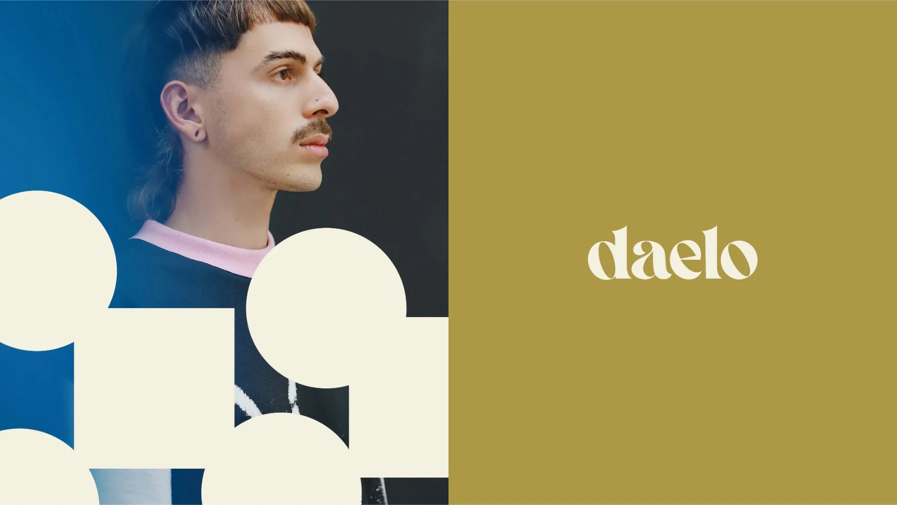
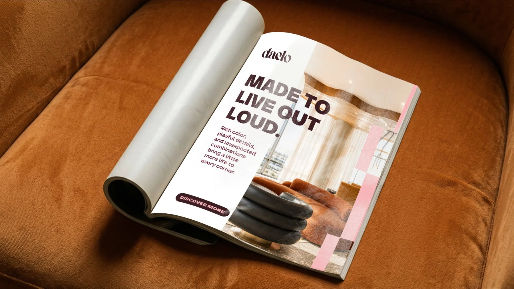
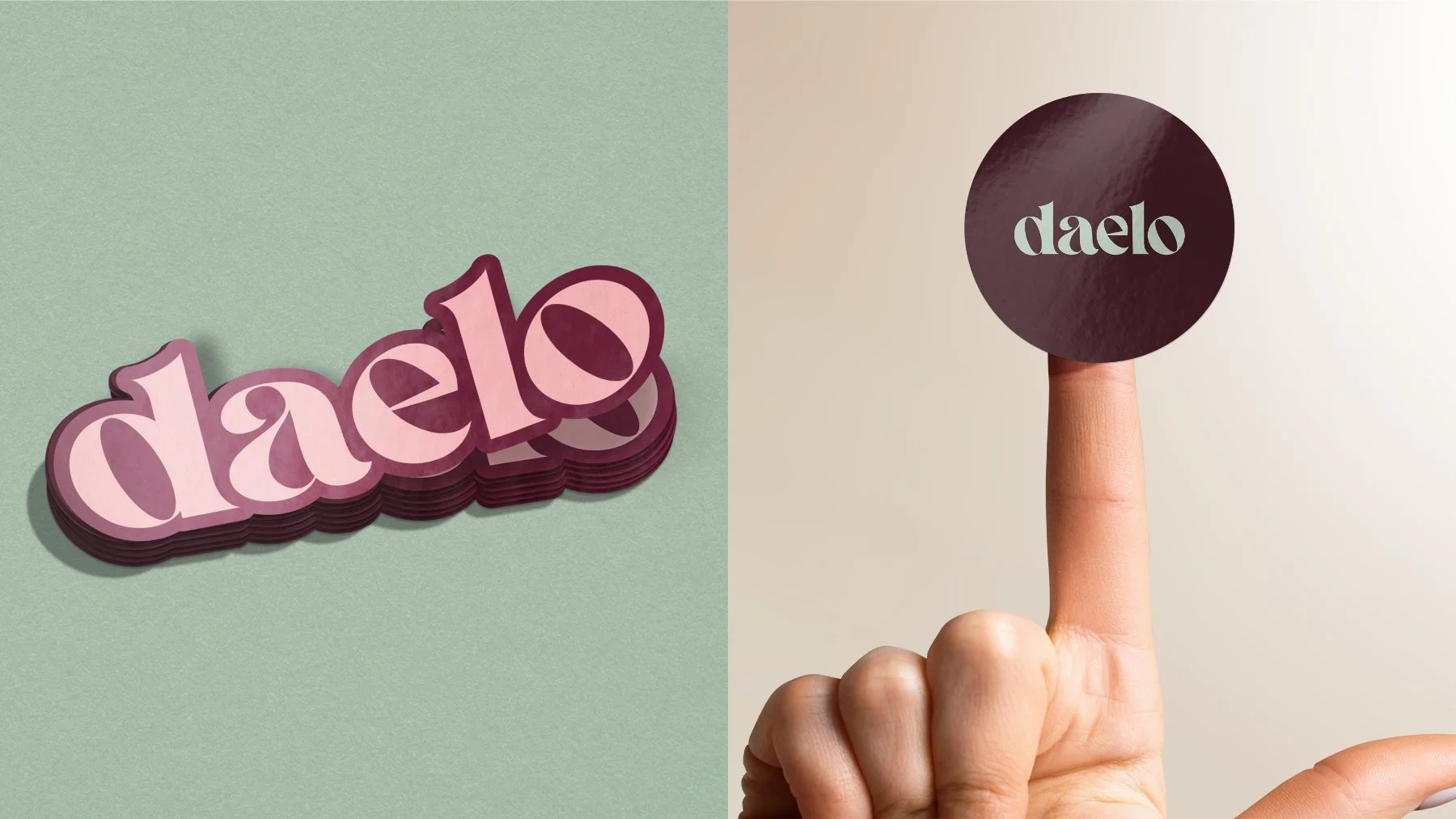
Bold typography gives the brand confidence, while funky letterforms and playful graphic accents bring personality to every application. Disco balls, starbursts and other expressive elements create moments of surprise and give Daelo a visual language that feels colorful, energetic and unmistakably its own.
One of the most distinctive elements comes directly from the site’s history. For years, a glowing neon sign of a dancing couple hung above The Ballroom, a longtime Fremont bar and pizza joint that later became Baila Bar. When the property changed hands, Holland Partner Group worked with the previous owner to save the sign, competing with the Las Vegas Neon Museum to keep this piece of Fremont history in the neighborhood.
The original sign will hang on the exterior of Daelo, and AFMKTG brought the dancing couple into the brand as a graphic illustration, carrying a piece of the site’s past into the new identity.
Color brings even more energy to the system. Rather than relying on a tightly restrained palette, Daelo embraces an unexpected mix of seafoam, pink, burgundy, mustard and other saturated hues. Each color can stand on its own, while surprising combinations keep the brand feeling fresh and alive across different touchpoints.
Copywriting & Messaging Framework
Daelo’s voice was built to create recognition, not persuasion. The right renter should read it and feel like they’ve found a place that gets them.
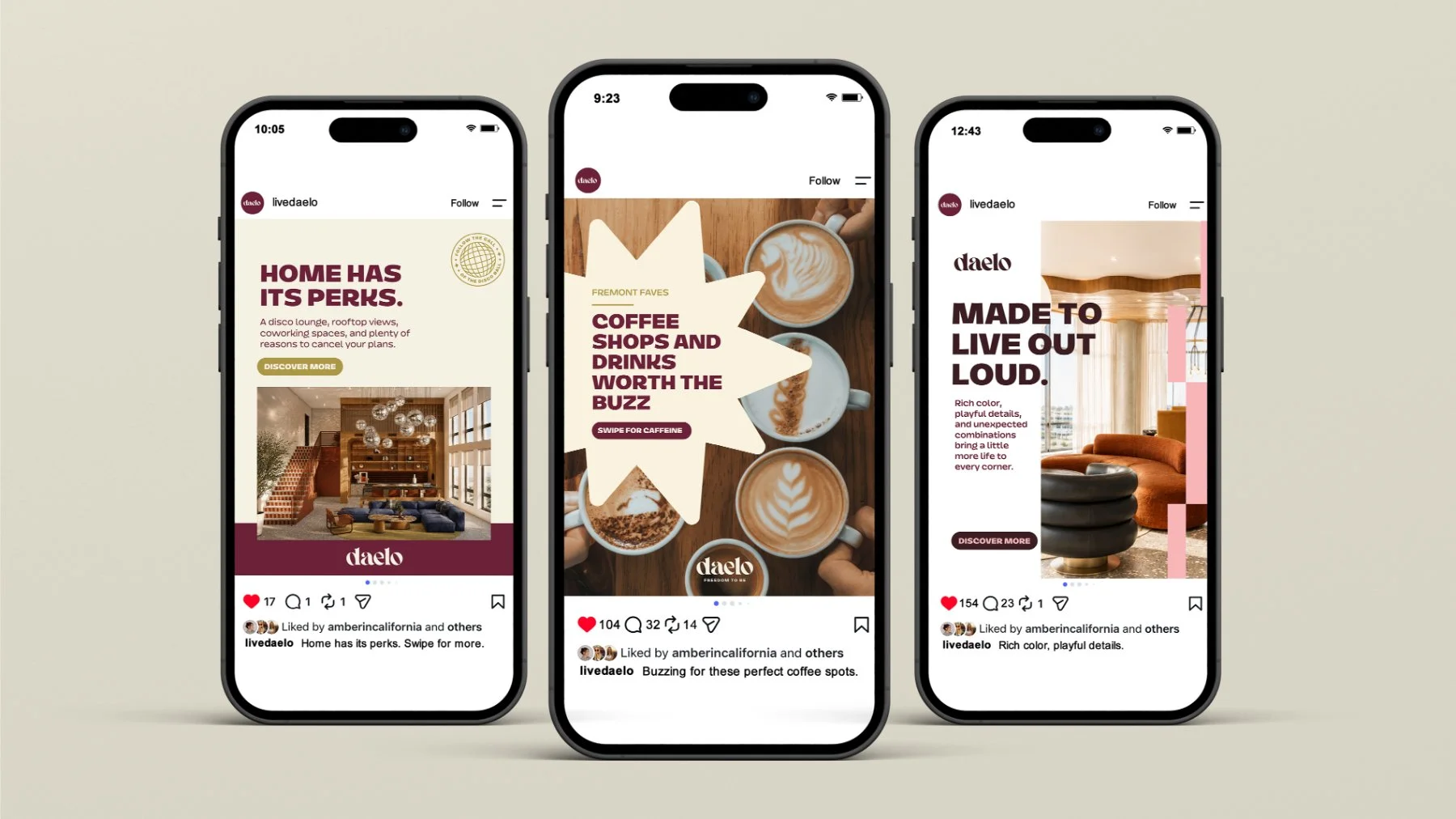
That meant writing with the same specificity and personality found throughout the property. Instead of broad claims, the copy names the things that make Daelo and Fremont what they are, from the Burke-Gilman Trail to the disco balls in the lounge. It’s inviting, playful and self-aware, with lines like, “Fremont calls itself the Center of the Universe. We haven’t found evidence to the contrary.”
Even practical messages leave room for personality. “Tell your goldendoodle we said hi.” says pet-friendly without sounding like every other apartment website. The result is a voice that feels human, specific and entirely comfortable being itself.
Key Deliverables
Brand Naming & Positioning Strategy
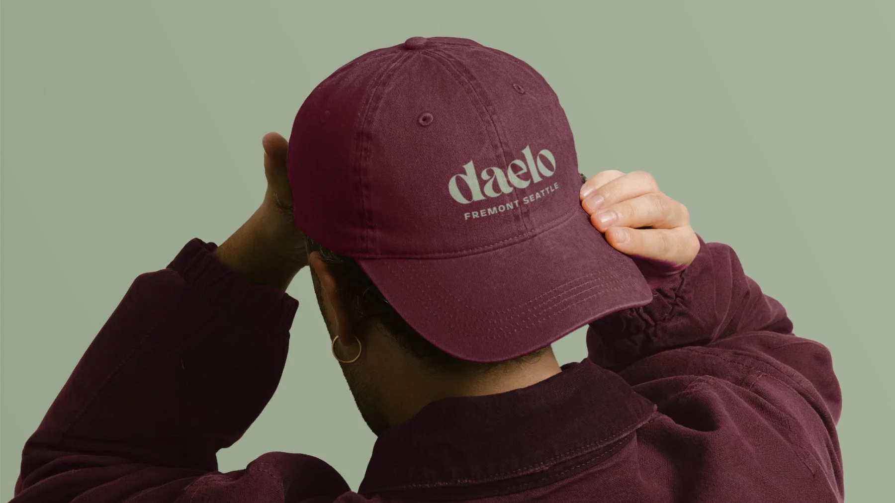
Logo & Visual Identity System
Brand Guidelines & Standards Documentation
Art Direction
Copywriting & Messaging Framework
Residence & Amenity Descriptions
Marketing & Leasing Copy
Related Work
Renley: Multifamily Branding in Arlington
Naming, brand identity, and copywriting for Gilbane Development
Resa: Multifamily Branding in Long Beach
Naming, brand identity, and copywriting for Holland Partner Group
Sloane: Multifamily Branding in Seattle
Brand strategy for Holland Partner Group's Pacific Northwest flagship
About AFMKTG
AFMKTG is a real estate development branding agency headquartered in California. The agency builds brand systems for multifamily, student housing, mixed-use, and hospitality developments across the country, from naming and identity to go-to-market strategy and social media management.
Start a project with AFMKTG
Great developments deserve brands with just as much ambition. Let’s build yours.
Inquire below or send your project details to hello@afmktg.com.
