
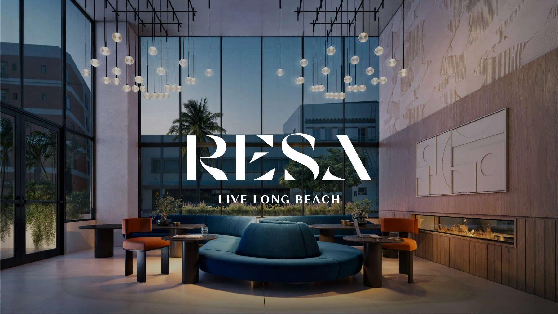
REsa
Naming, Brand Identity, Copywriting & Environmental Design for Holland Partner Group
Developed by Holland Partner Group, RESA is a multifamily residential community located in Downtown Long Beach. AFMKTG partnered with the development team to create a brand rooted in architecture, movement, and the authentic culture of Long Beach. From naming and visual identity to copywriting and environmental design, every element was developed to create a cohesive brand experience that extends throughout the property while supporting leasing and long-term market positioning.
About the Project
Project Overview
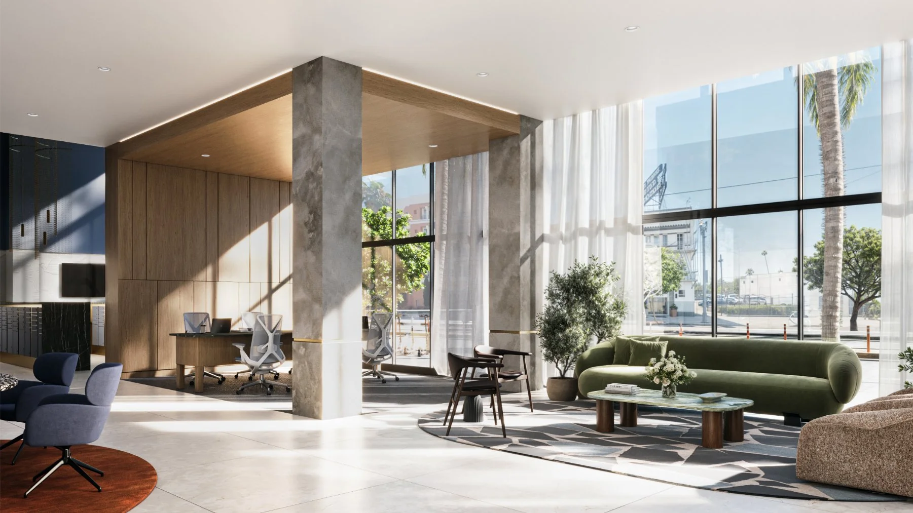
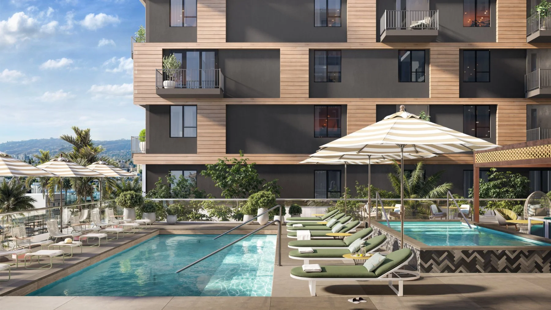
Located in the heart of Downtown Long Beach, RESA was envisioned as a residential community that reflects the city's creative energy, cultural diversity, and independent spirit. Rather than relying on conventional luxury apartment branding, the opportunity was to create an identity that felt approachable, design-driven, and true to the neighborhood.
The project's defining architectural feature, an open-air passage integrated into the ground floor, became the foundation of the brand story. The name, messaging, and visual identity celebrate movement, connection, and discovery while reinforcing the relationship between residents, local businesses, and the surrounding city.
AFMKTG's Approach
AFMKTG was engaged to develop the project's name, positioning, visual identity, messaging, copywriting, and environmental branding. Working alongside the development and design teams, we created a fully integrated brand system that informed both the marketing experience and the physical environment.
Rather than treating branding as a layer applied after design, the identity became an extension of the architecture itself. Every touchpoint, from the logo and messaging to unit identification and wayfinding, was designed to reinforce the project's unique story and create a memorable resident experience.
Brand Naming & Positioning
The name RESA comes from the Swedish word for passage, directly referencing the project's open-air architectural corridor that connects the building to the surrounding neighborhood. The name also carries a broader relevance to Long Beach itself. As home to one of the world’s busiest ports, the city serves as a major passageway for global commerce, moving millions of containers each year and connecting people, goods, and places across the world.
More than a physical feature or a nod to the city, the passage symbolizes movement between people, commerce, and place, reflecting the energy and openness that define Downtown Long Beach.
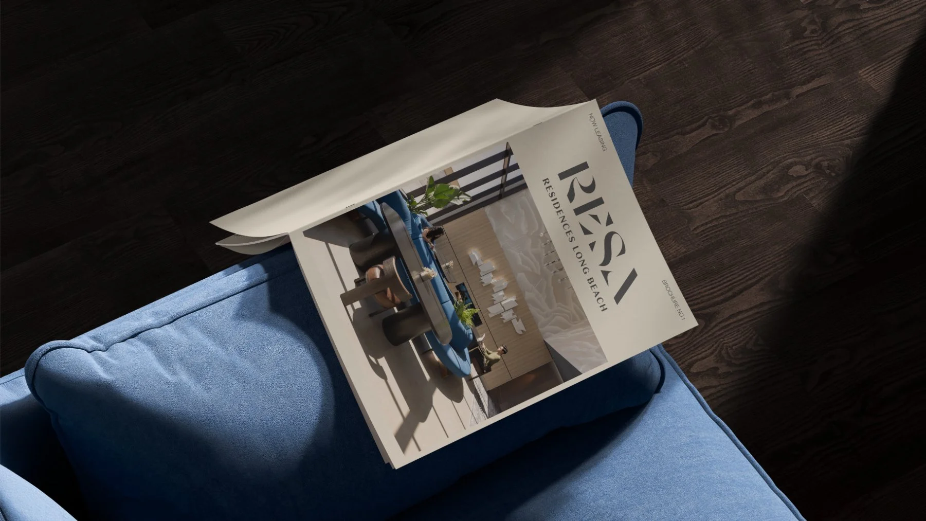
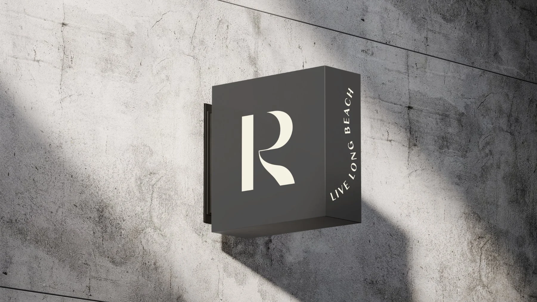
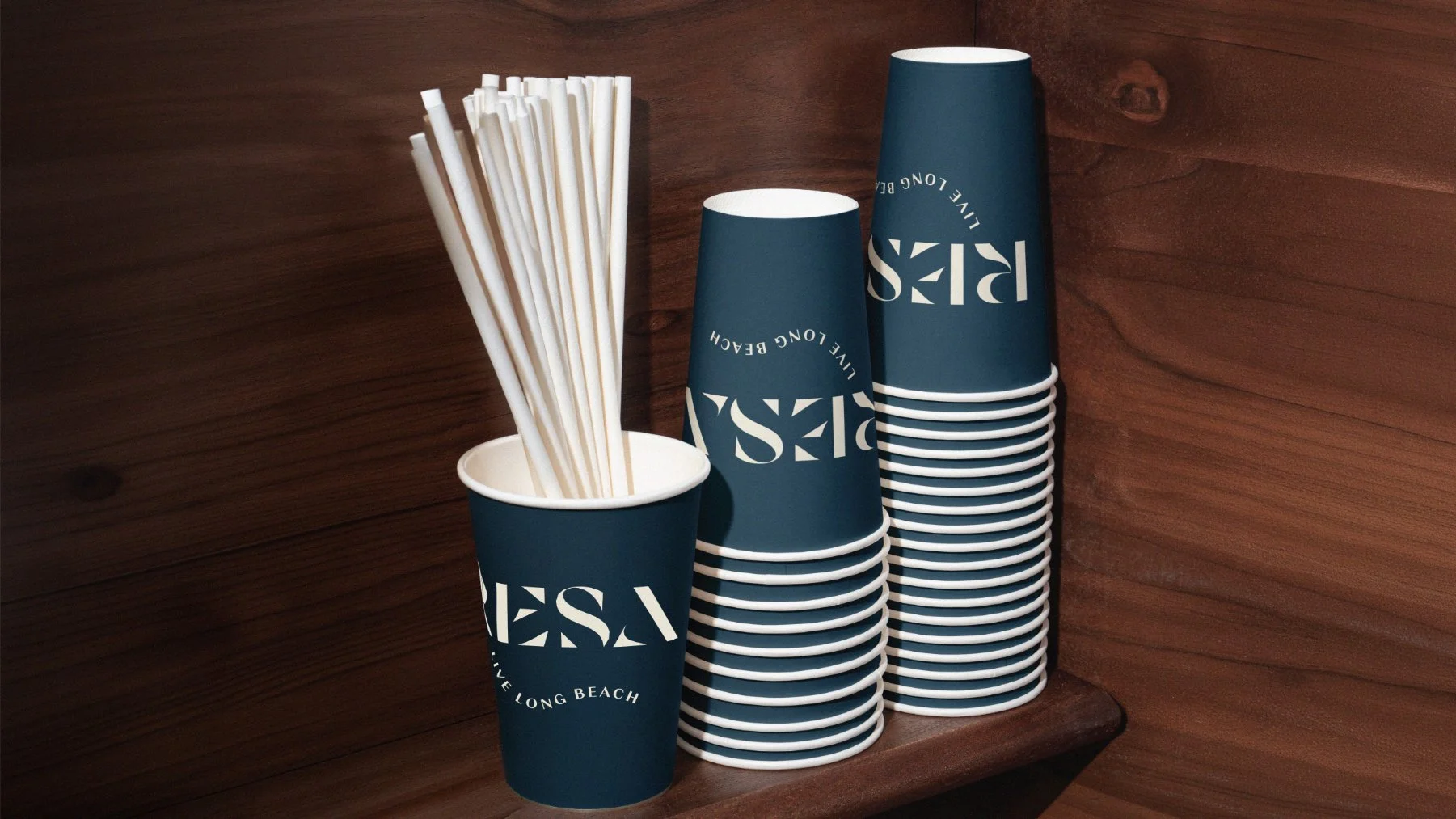
This concept is embedded throughout the identity, including the custom wordmark where the letters subtly incorporate the form of a passageway. Supporting the name is the brand platform, "Come & Go, As You Are," a simple expression of authenticity, inclusivity, and everyday urban living.
RESA was positioned for renters who value individuality, thoughtful design, and brands with genuine stories. The result is an identity that feels confident without pretension and contemporary without chasing trends.
Visual Identity & Art Direction
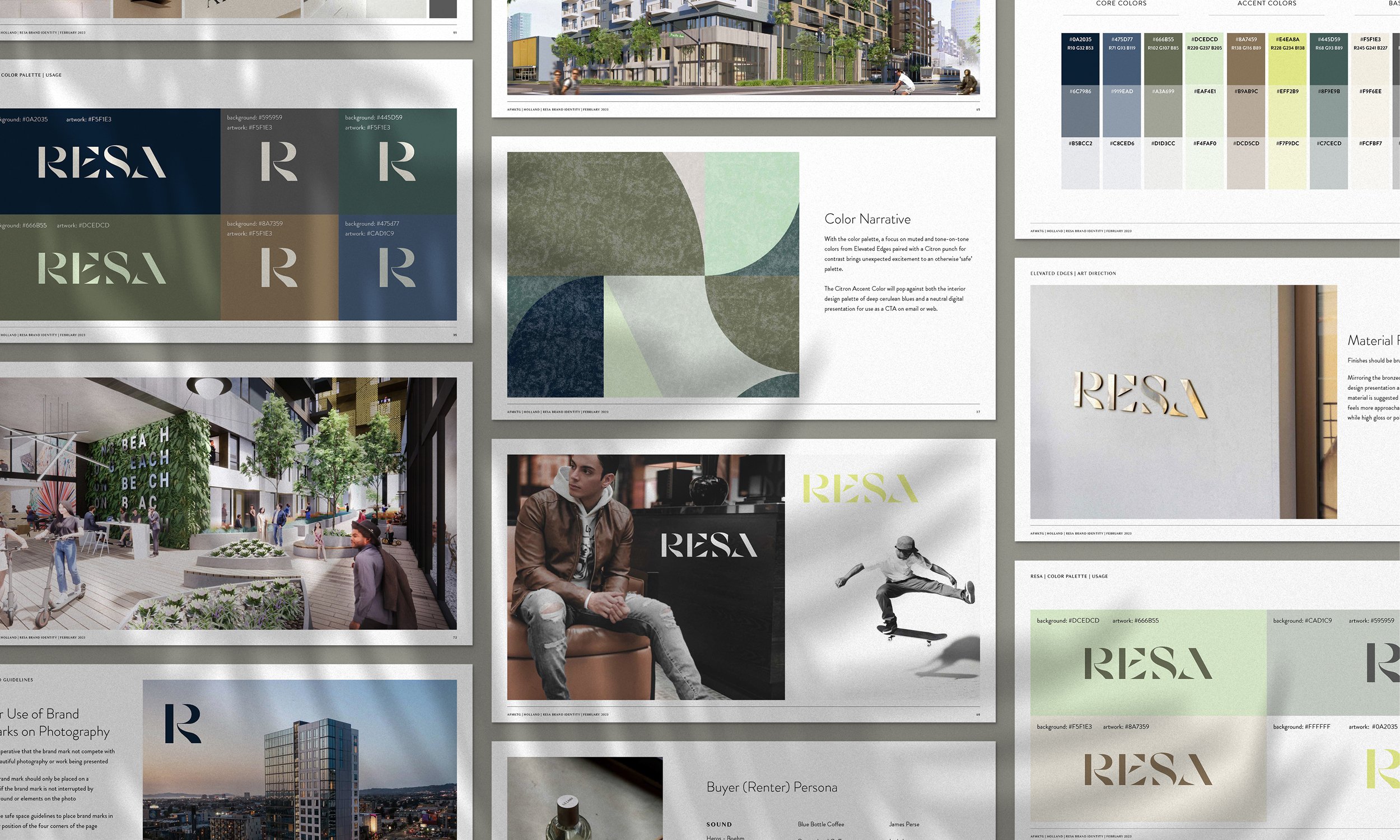
The visual identity embraces restraint, allowing typography, materiality, and architectural form to define the brand. An intentionally minimal color palette with a pop of neon green creates a refined presentation that complements the project's contemporary interiors while allowing texture, scale, and composition to become the primary visual language.
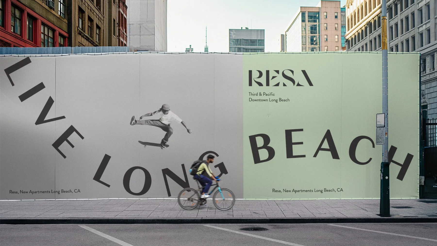
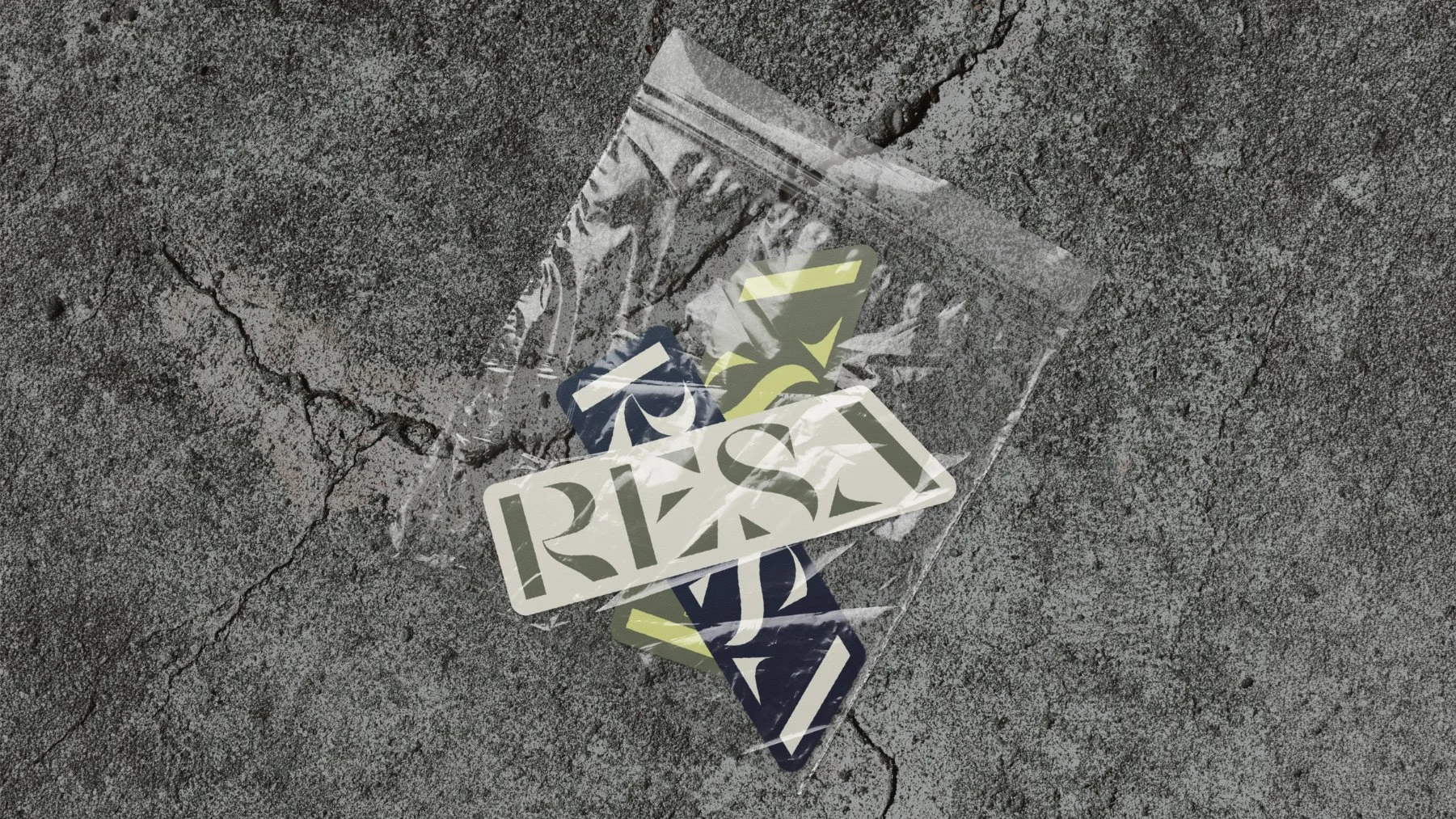
Organic forms, unexpected movement, and custom environmental graphics introduce moments of personality throughout the property. From unit identification and floor-level signage to wayfinding elements, the brand creates an experience that feels sophisticated, tactile, and distinctly human.
Copywriting & Messaging Framework
Messaging was developed to reflect the character of both the property and the people who call it home. The voice is welcoming, grounded, and authentic, avoiding traditional luxury apartment language in favor of a tone that feels genuine and culturally connected.
Inspired by Long Beach's diversity and creative spirit, the messaging reinforces RESA as a place where individuality is celebrated and residents are encouraged to simply come and go, as they are. The result is a leasing story that feels memorable, emotionally resonant, and true to the project's identity.
Key Deliverables
Brand strategy and positioning
Brand naming
Visual identity design
Brand messaging framework
Copywriting
Environmental branding and signage
Brand guidelines
Related Work
Sloane: Multifamily Branding in Seattle
Brand strategy for Holland Partner Group's Pacific Northwest flagship
Renley: Multifamily Branding in Arlington
Naming, brand identity, and copywriting for Gilbane Development
Daelo: Multifamily Branding in Seattle
Naming, brand identity, positioning & copywriting for Holland Partner Group
About AFMKTG
AFMKTG is a real estate development branding agency headquartered in California. The agency builds brand systems for multifamily, student housing, mixed-use, and hospitality developments across the country, from naming and identity to go-to-market strategy and social media management.
Start a project with AFMKTG
Great developments deserve brands with just as much ambition. Let’s build yours.
Inquire below or send your project details to hello@afmktg.com.
