

Oasi
Brand Identity, Copywriting & Marketing Design for Blue Heron
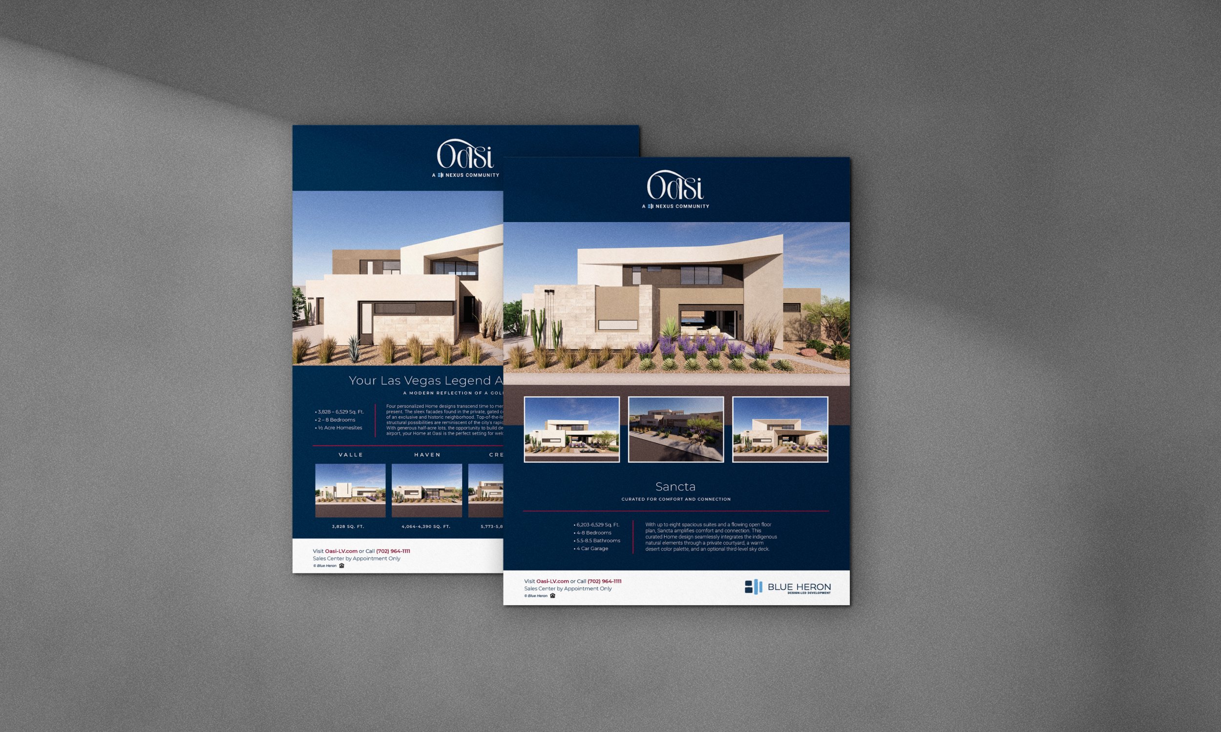
Built by Blue Heron, Oasi is a collection of architecturally significant modern homes in Las Vegas, Nevada. AFMKTG partnered with the award-winning luxury homebuilder to develop the brand identity, messaging, and marketing communications for Oasi while producing a comprehensive suite of sales and environmental collateral across the Oasi, Shoreline, and Prado communities.
The result of the Oasi brand development is an identity that blends the romance of Las Vegas' history with Blue Heron's contemporary design philosophy, creating a timeless identity that supports one of the city's most respected luxury residential developers.
Renderings inset in mockups produced by Blue Heron




ABOUT THE PROJECT
Project Overview
Blue Heron has become synonymous with innovative architecture and exceptional craftsmanship, earning national recognition for its custom residences, including VM001, which set the record for the highest priced residential home in Las Vegas history at the time of its sale.
Located on land long believed to be the original oasis from which Las Vegas emerged, Oasi presented an opportunity to tell a story rooted in place. Rather than focusing solely on contemporary architecture, the brand draws from the city's history, mythology, and enduring sense of possibility. The result is an identity that feels both nostalgic and modern, honoring the past while reflecting Blue Heron's forward-thinking approach to design.
AFMKTG's Approach
AFMKTG developed the visual identity and messaging for Oasi with the goal of creating a brand that could stand alongside Blue Heron's celebrated architectural work while reinforcing the developer's reputation for innovation and design excellence.
Beyond the primary identity, AFMKTG created a broad collection of marketing and graphic design assets supporting three Nexus communities: Oasi, Shoreline, and Prado. Every touchpoint was designed to deliver a consistent brand experience across digital, print, environmental, and sales materials.
Brand Naming & Positioning
The name Oasi, derived from the Italian word for oasis, reflects both the property's geographic significance and its emotional promise. Built on land rumored to be the original oasis that gave rise to Las Vegas, the brand celebrates the city's legendary origins while positioning the community as a rare destination within the desert landscape.
The identity embraces a sense of vintage Las Vegas glamour without becoming nostalgic for nostalgia's sake. Drawing inspiration from the founder's family's deep ties to the city's history, the brand balances heritage with innovation, creating a distinctive positioning that feels sophisticated, memorable, and uniquely connected to place.
Visual Identity & Art Direction
The custom wordmark draws inspiration from the elegance of 1960s automotive branding, referencing iconic marques such as Cadillac and Chevrolet through expressive script lettering, graceful flourishes, and timeless sophistication.
The identity intentionally incorporates elements of mystery, glamour, and storytelling, creating a logo that feels iconic rather than contemporary. This vintage influence is balanced by restrained typography, refined layouts, and premium production techniques that align with Blue Heron's architectural aesthetic.
Across brochures, signage, digital advertising, and sales materials, the visual system creates a cohesive brand experience that reinforces the prestige of the homes while celebrating the enduring mythology of Las Vegas.
Copywriting & Messaging Framework
Messaging was developed to mirror the confidence and sophistication of the visual identity while capturing the romance of the Oasi story. Website copy, direct mail campaigns, digital advertising, email marketing, and environmental messaging all reinforce a narrative rooted in heritage, craftsmanship, and architectural excellence.
The brand voice is confident, aspirational, and timeless, positioning Oasi as more than a collection of luxury homes. It presents the community as an address shaped by history, elevated by design, and built for discerning homeowners seeking something truly distinctive.
Key Deliverables
Brand strategy and positioning
Visual identity design
Brand messaging and copywriting
Marketing collateral and sales materials
Environmental graphics and signage
Digital marketing assets
Brand guidelines
Related Work
Renley: Multifamily Branding in Arlington
Naming, brand identity, and copywriting for Gilbane Development Company
Resa: Multifamily Branding in Long Beach
Naming, brand identity, and copywriting for Holland Partner Group
Sloane: Multifamily Branding in Seattle
Brand strategy for Holland Partner Group's Pacific Northwest flagship
About AFMKTG
AFMKTG is a real estate development branding agency headquartered in California. The agency builds brand systems for multifamily, student housing, mixed-use, and hospitality developments across the country, from naming and identity to go-to-market strategy and social media management.
Start a project with AFMKTG
We work with a select number of developers each year.
Inquire or call 858-215-1650 to start the conversation.