Architectural Inspired Branding for Dezi by CityMark
Introduction
At AFMKTG, our mission is to harness the essence of a neighborhood and the architectural intrigue of a site to create a compelling story that residents or homeowners will connect with. This philosophy guided AFMKTG in developing the brand for a new multi-family community in the Serra Mesa neighborhood of San Diego.
Tasked with developing a name and brand identity for this project by CityMark, which includes 99 units (townhomes and apartments) across three distinct sites, our mission was to encapsulate the essence of modern living while paying homage to the area's mid-century allure. This case study details the process of naming and branding for this multi-family community, crafting a narrative that not only defines the space but invites residents to a destination they can proudly call home.
NAMING
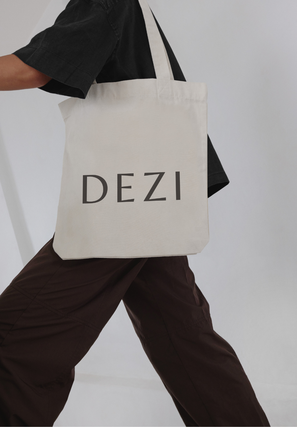
After the development of a creative brief, research and presentation of 12 possible names that drew from multiple themes, the development team selected the name “Dezi” for this project.
The inception of the name “Dezi” is a fresh twist on the concept of "Destination." The name was inspired by the mid-century modern aesthetic prevalent in the design and architecture of this multi-family project, and is also short, memorable and easy to pronounce. The essence of Dezi was to embody a spirit reflective of the community's architectural appeal and consumer trends.
In the naming process, the AFMKTG team conducted an intensive research and brainstorming process to provide our developer clients with a selection of names that were relevant, current, unique and thoughtful. A general conflict search is conducted to eliminate any names that may already be in use for a similar project in the local geographical area and a brand narrative is created to support each name presented to the team.

aRCHITECTURAL COLLABORATION
Drawing inspiration from the distinctive breeze blocks adorning the exterior elevation of the buildings, the brand mark encapsulates the essence of mid-century modern design. These blocks, consistent across the development's three sites, serve as a visual anchor, symbolizing unity and architectural elegance. AFMKTG’s founder and creative director, Amber Frankhuizen, collaborated with the project’s developer, CityMark, the project’s architect, McKinley Associates Inc, and the project’s interior design team, Catalina Design Group, to recommend and ultimately select breeze block for the project.
The block was selected to tie into a story - with three sites located at 2696 Serra Mesa, 3222 Serra Mesa, and 3241 Serra Mesa - the final selection of the breeze block with three distinct parts was inspired by representing each location to bring unity to the project.

Brand mark & Logo mark
In the development of a brand and logo mark for a project, once a name is selected, AFMKTG’s design team and creative director will further refine the creative brief to include new insights and direction before kicking off on the design process. Within 3-4 weeks of name selection, the AFMKTG team will present between 4-8 brand mark and logo options for the development team and any salient stakeholders (including capital partners, architectural teams, interior design teams, etc.) Throughout this collaborative process, the AFMKTG team will receive feedback from the stakeholders to refine and perfect the final design selected by the group.
The final design selected by this team:

The letter forms in the brand mark are slightly askew, giving the clean and legible font a bit of personality. The illustrative logo mark with three distinct squares is influenced by the breeze block selected for the property and symbolizes each “block” of the neighborhood community’s three distinct sites.
Color Palette and Typography
The chosen color palette bursts with life, mirroring the vibrant lifestyle Dezi promises its residents. It reflects the natural landscape of the surrounding areas, compliments the exterior architecture colors and is punctuated with pops of color to attract a diverse and dynamic community. The typography selected reinforces Dezi's identity, balancing readability with a stylistic nod to the mid-century modern era.


Application Across Media
The comprehensive brand guidelines meticulously detail the application of Dezi's identity across various media. From signage that beckons with its unique shapes to marketing materials that capture the essence of Dezi's vibrant community, every touchpoint is a testament to the brand's carefully crafted narrative. The result is a cohesive and immersive experience that not only captures the imagination but also warmly invites residents and visitors to explore what it means to call Dezi home.
Conclusion
The naming and branding process for Dezi is a testament to AFMKTG's expertise in Multifamily Real Estate Marketing and dedication to creating meaningful and impactful brand identities. By drawing inspiration from the architectural features and the area's mid-century modern heritage, AFMKTG crafted a brand that resonates with the target audience and enriches the community experience.
Dezi stands as a modern destination with a nod to the past, inviting residents to a place where they can find their home's destination. Through meticulous attention to detail, strategic planning, and creative execution, Dezi's identity encapsulates contemporary living, setting a new standard for apartment community branding.